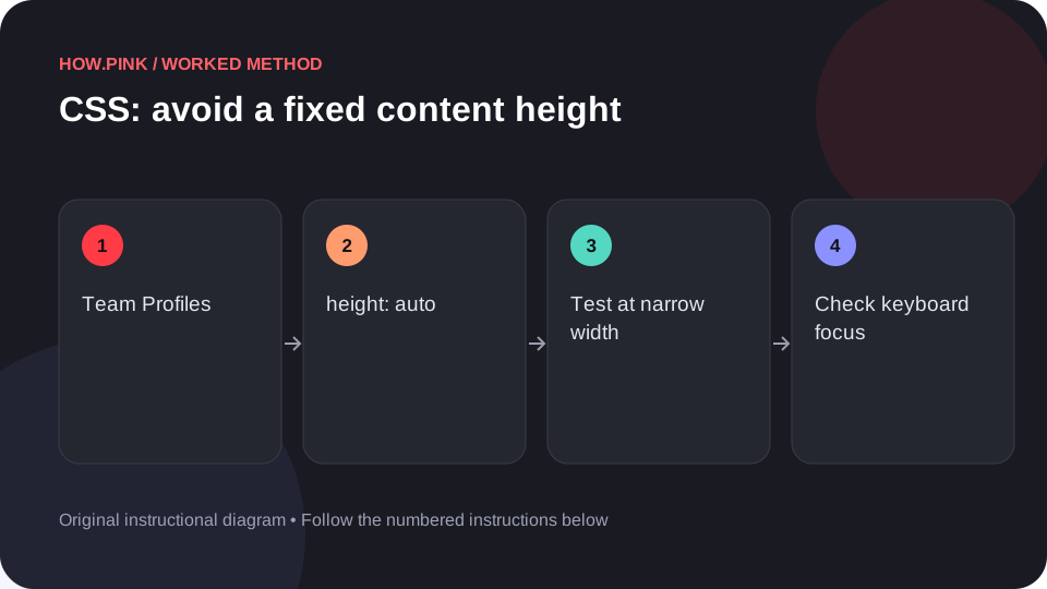
Build a small standalone HTML example to avoid a fixed content height for team profiles, then check the behavior at narrow and wide viewport sizes. This worked guide uses a small reproducible example so you can check the result before adapting it to your own task.
Antes de empezar
- A plain-text editor
- A modern web browser
- Basic familiarity with HTML elements and CSS declarations
Guía paso a paso
Create an isolated HTML example
Create a new folder and save a plain-text file named index.html. Use an isolated practice file so the experiment does not change a live page. The example uses semantic HTML, a system font and local CSS.

Paste the complete sample
Paste the following into index.html and save it. It includes a viewport declaration, the component styles, and a small-screen rule.
<!doctype html>
<html lang="en">
<head>
<meta charset="utf-8">
<meta name="viewport" content="width=device-width, initial-scale=1">
<title>Team Profiles CSS practice</title>
<style>
* { box-sizing: border-box; }
body { margin: 0; padding: 2rem; font-family: system-ui, sans-serif; }
.panel { height: auto; min-height: 8rem; }
.panel > * { min-width: 0; }
button { font: inherit; padding: .75rem 1rem; }

.panel > * + * { margin-block-start: 1rem; }
.action { margin-top: auto; }
button:focus-visible { outline: 3px solid #185cce; outline-offset: 3px; }
@media (max-width: 36rem) { .panel { grid-template-columns: minmax(0, 1fr); } }
</style>
</head>
<body>
<section class="panel team-profile" aria-label="Team Profiles example">
  <div><h1>Team Profiles</h1><p>A short title and supporting text make the first item easy to inspect.</p></div>
  <div><h2>Second item</h2><p>Use a longer sentence here to test wrapping, spacing and different text lengths.</p></div>
  <div class="action"><button type="button">Example action</button></div>
</section>
</body>
</html>Inspect the intended visual result
The panel can grow with longer text instead of clipping it. Open index.html in your browser and compare it with that description. This is a schematic practice component; the example button has no application action attached.
Test narrow screens and keyboard use
Resize the browser to a narrow phone-like width and then back to desktop width. Look for text clipping and unwanted horizontal scrolling. Press Tab to reach the sample button; its focus indicator should remain visible. Increase browser zoom to 200% and confirm the main text can still be read.
Move the pattern into your component
Copy the .panel rule into the stylesheet for your team profiles. Replace .panel with your project’s actual component class so the rule is scoped. Keep the narrow-screen override and test with real text, translated text and empty content before publishing.
Consejos y solución de problemas
- Use the browser’s developer tools to see which CSS rule wins when your project overrides a property.
- A layout demonstration does not supply application behavior; connect real buttons to meaningful actions.
- Check actual foreground/background contrast after changing the colors.
Preguntas frecuentes
Why does the sample look different in my project?
Existing CSS may override the sample. Inspect computed styles and scope your selector to the component.
Does this require JavaScript?
The demonstrated appearance uses HTML and CSS. Interactive actions may require application code beyond this layout example.