THE KNOW-HOW COLLECTIONFind your next “I did it.”
Small questions, big projects, and everything in between. Pick a guide and take the first step.
1,000 tutorialsSomething useful is just a step away.
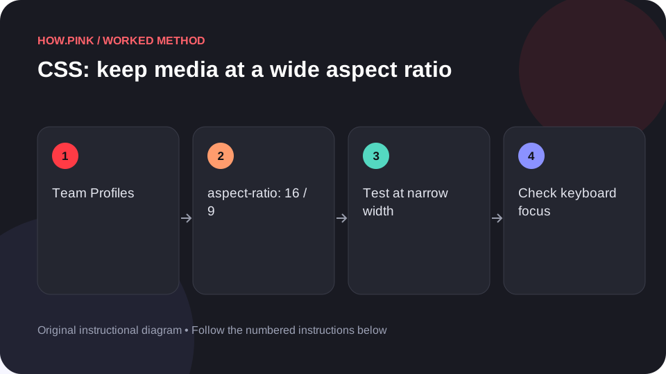 Web design & CSS
Build a small standalone HTML example to keep media at a wide aspect ratio for team profiles, then check the behavior at narrow and wide viewport sizes.
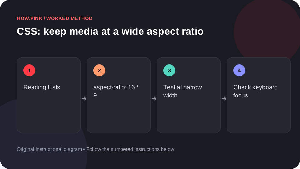 Web design & CSS
Build a small standalone HTML example to keep media at a wide aspect ratio for reading lists, then check the behavior at narrow and wide viewport sizes.
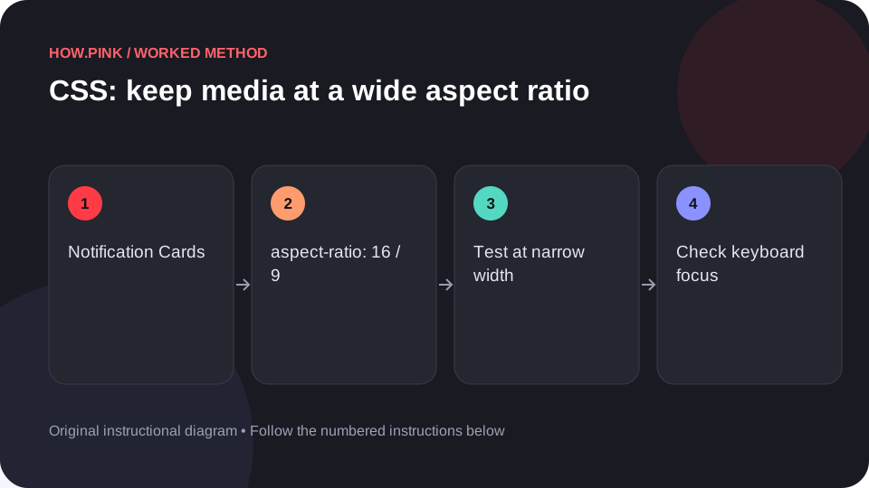 Web design & CSS
Build a small standalone HTML example to keep media at a wide aspect ratio for notification cards, then check the behavior at narrow and wide viewport sizes.
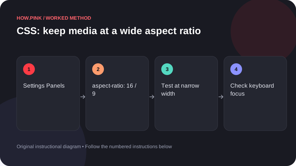 Web design & CSS
Build a small standalone HTML example to keep media at a wide aspect ratio for settings panels, then check the behavior at narrow and wide viewport sizes.
 Web design & CSS
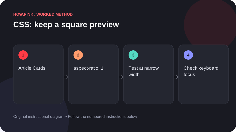
Build a small standalone HTML example to keep a square preview for article cards, then check the behavior at narrow and wide viewport sizes.
 Web design & CSS
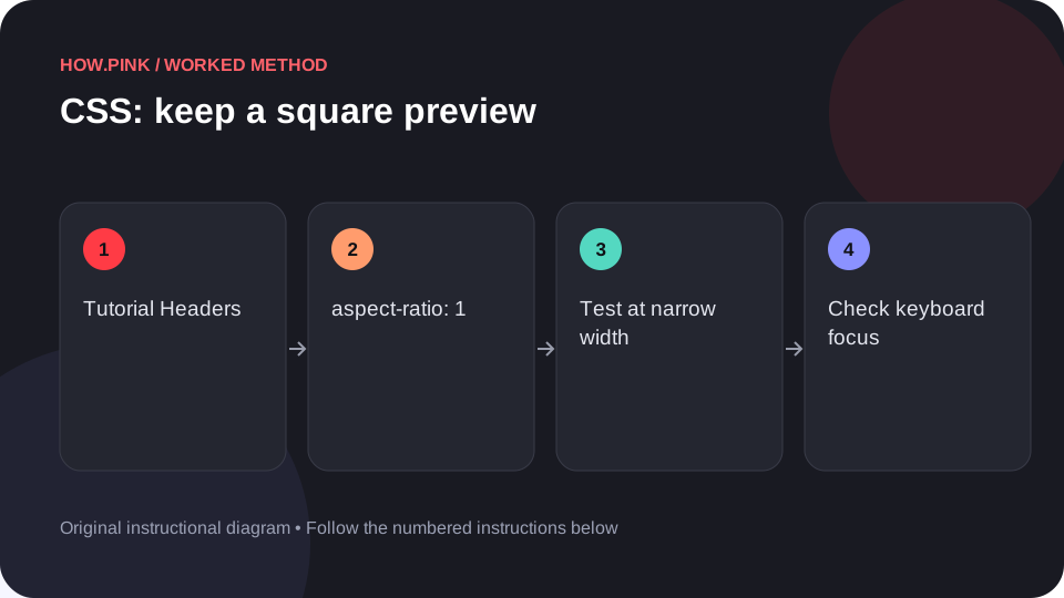
Build a small standalone HTML example to keep a square preview for tutorial headers, then check the behavior at narrow and wide viewport sizes.
 Web design & CSS
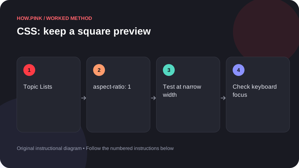
Build a small standalone HTML example to keep a square preview for topic lists, then check the behavior at narrow and wide viewport sizes.
 Web design & CSS
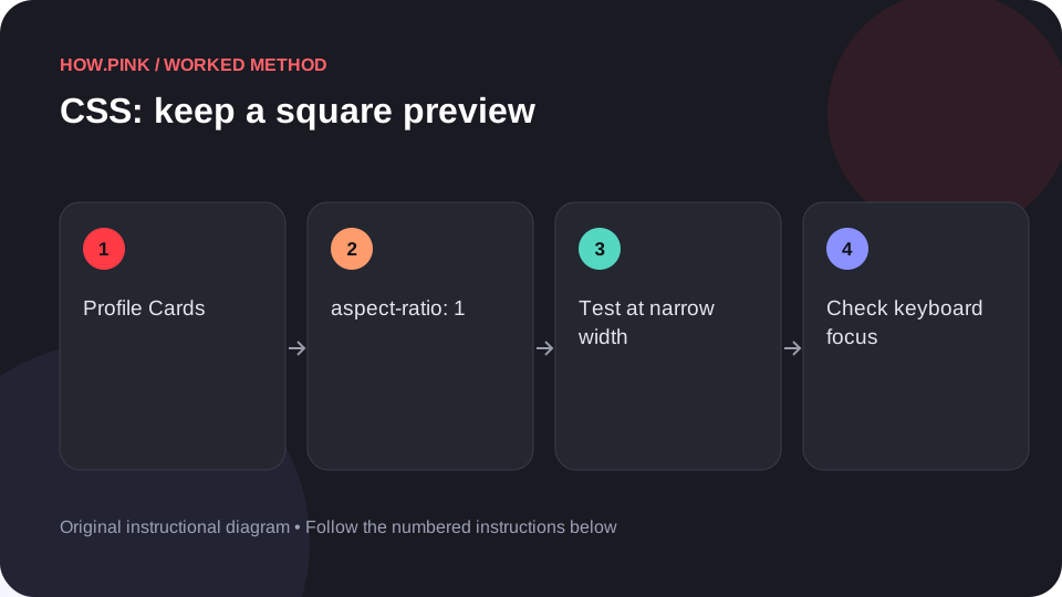
Build a small standalone HTML example to keep a square preview for profile cards, then check the behavior at narrow and wide viewport sizes.
 Web design & CSS
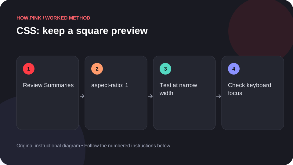
Build a small standalone HTML example to keep a square preview for review summaries, then check the behavior at narrow and wide viewport sizes.
 Web design & CSS
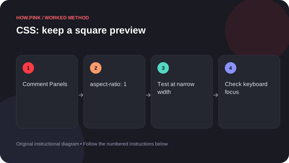
Build a small standalone HTML example to keep a square preview for comment panels, then check the behavior at narrow and wide viewport sizes.
 Web design & CSS
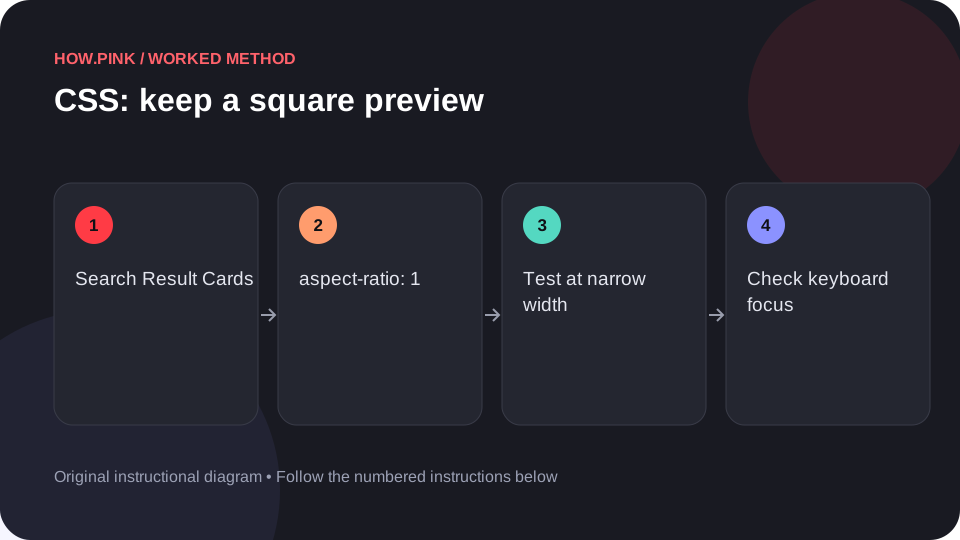
Build a small standalone HTML example to keep a square preview for search result cards, then check the behavior at narrow and wide viewport sizes.
 Web design & CSS
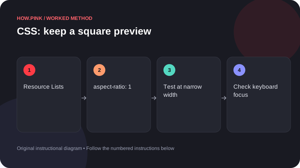
Build a small standalone HTML example to keep a square preview for resource lists, then check the behavior at narrow and wide viewport sizes.
 Web design & CSS
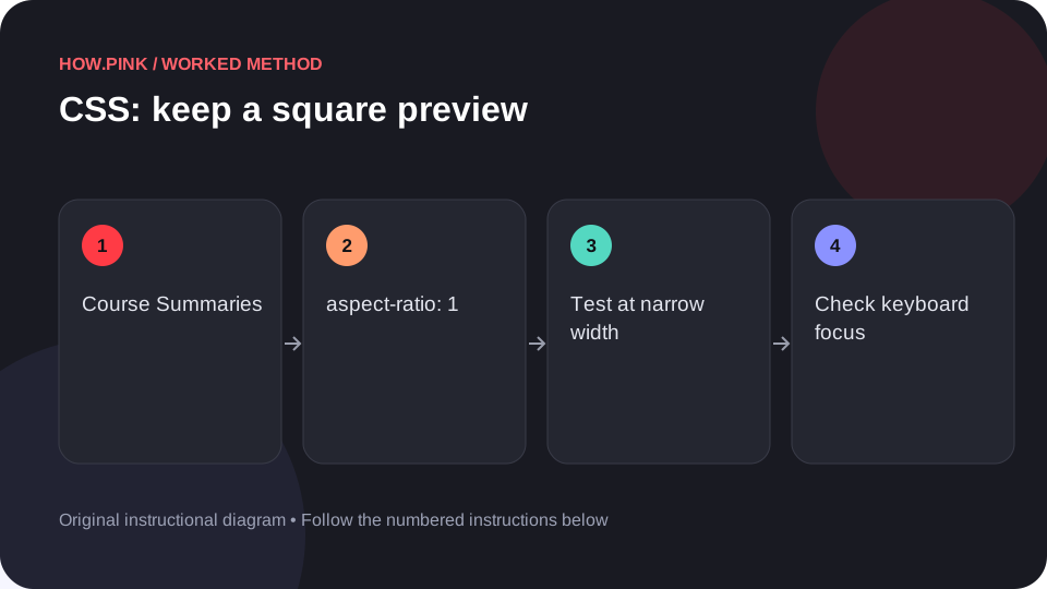
Build a small standalone HTML example to keep a square preview for course summaries, then check the behavior at narrow and wide viewport sizes.
 Web design & CSS
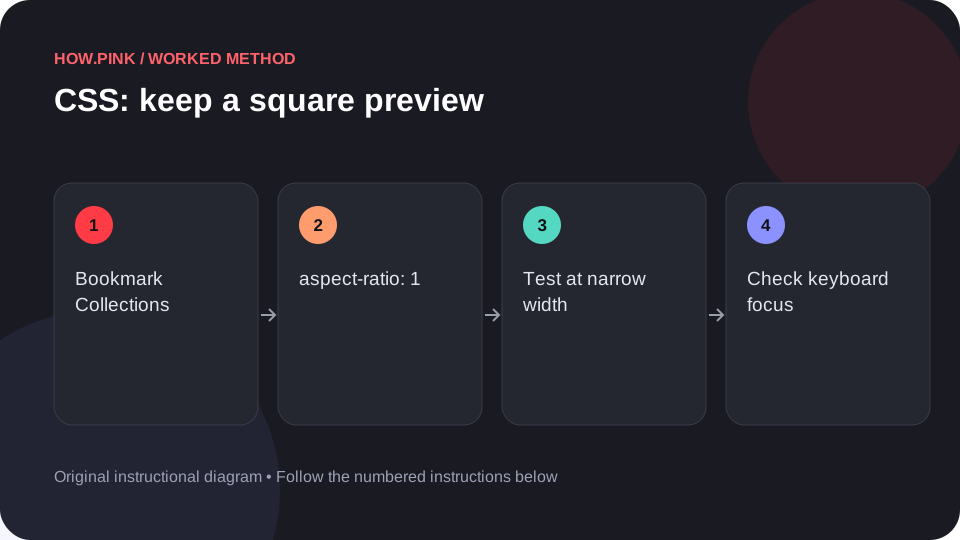
Build a small standalone HTML example to keep a square preview for bookmark collections, then check the behavior at narrow and wide viewport sizes.
 Web design & CSS
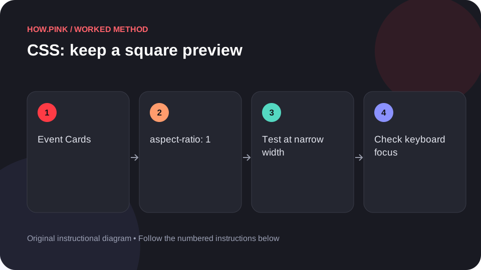
Build a small standalone HTML example to keep a square preview for event cards, then check the behavior at narrow and wide viewport sizes.
 Web design & CSS
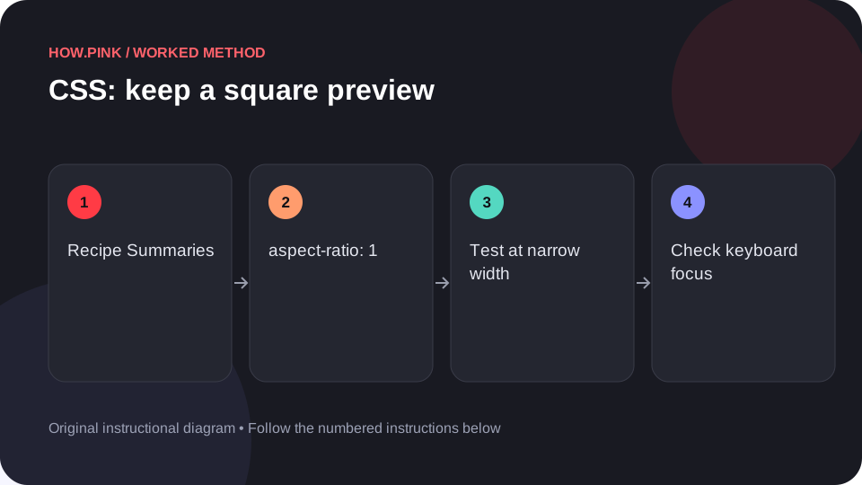
Build a small standalone HTML example to keep a square preview for recipe summaries, then check the behavior at narrow and wide viewport sizes.
 Web design & CSS
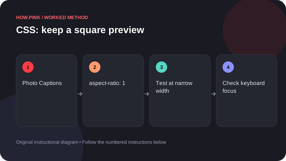
Build a small standalone HTML example to keep a square preview for photo captions, then check the behavior at narrow and wide viewport sizes.
 Web design & CSS
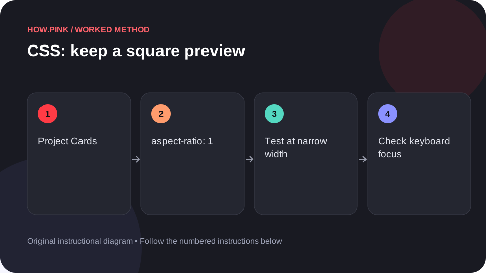
Build a small standalone HTML example to keep a square preview for project cards, then check the behavior at narrow and wide viewport sizes.